
NPB Alternate Uniforms
Posted by japanstats on 2008 June 20日 Friday
Following the NPB throwback uniforms post, this time we have the NPB non-throwback alternate uniform special.
First, let’s just get a general sense of what NPB uniforms look like. These are all the NPB managers wearing their home uniforms circa 2006. The only major change we’ve had since then is the Tigers who are now using their 80’s throwbacks full-time as their home unis (mentioned in the post linked above), great move!
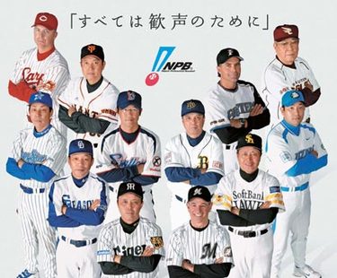
I don’t know of any Hiroshima Carp alternates, so I’ll just note that that’s Marty Brown pictured on the top left corner.
Hanshin Tigers (bottom row, third from left)
2006 Interleague Uniforms can be found from the post linked at the top of this post, they were 80’s throwbacks.
2007 Interleague Uniforms (designed by some fancy designer… lame)

2008 Interleague Uniforms (even worse! looks like someone took an eraser and deleted pinstripes from various parts of the unis and added yellow blotches, a much more sensible move would be to use even older throwbacks as alternates since this is a team with history)

Fukuoka SoftBank Hawks (bottom row, second from right)
Managed by the flamingo stance slugging legend himself, Sadaharu Oh.
2006 Hawk Festival Uniform

2008 Hawk Festival Uniform (both versions suck, this shade of yellow just doesn’t work as the primary colour, SoftBank unis are ugly to begin with anyways, they look like slo-pitch unis or something)

Saitama Seibu Lions (bottom row, far right)
2007 Summer Uniform (apparently the red lines represent fangs or claws of the lion or something, ugly)

2008 Interleague Uniform (stars on shoulders, what is this, an all-star uniform? unnecessary)

Chiba Lotte Marines (bottom row, third from right)
Managed by Bobby Valentine. Fantastic fan support, ugly alternate uniforms. Get a load of this.
2005 Alternate Uniform (black pants and white top!?!? Definitely the ugliest alternates we’ve seen in recent history – polyester heaven of the 70’s and 80’s are a whole another matter)

2007 Sunday Uniform (happi coat inspired, comes with ugly hat too)

Yokohama BayStars (bottom row, far left in the group photo above)
2006 Summer Uniforms (pretty sharp, IMO)

2006 Interleague Uniform (nice, simple design)

2007 Interleague Uniforms (added red, the colour of the symbolic red brick warehouses of Yokohama port, I prefer the cleaner look from the year before, but still not a disaster)

2008 Interleague Uniform (just added gold lines to the shoulders from last year?)

The team is an absolute disaster, with a winning percentage lower than .300 this season, but the uniforms are not bad.
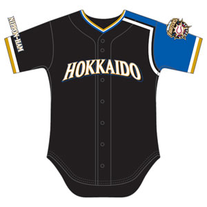
Hokkaido Nippon-Ham Fighters (top row, second from right in group photo, that’s Trey Hillman)
Yes, they’re the Fighters that play up in Hokkaido owned by the Nippon Ham meat packing company, NOT the Ham Fighters (I think the American media are finally catching onto this).
2007 We Love Hokkaido Uniform (great stuff! Having Hokkaido across the chest looks much sharper than the company name it usually has on road unis, and really nice shade of blue)

2008 Hokkaido Uniforms (reversed colour scheme from previous year, but black uniforms are passe)
So, umm, yeah, other than the BayStars and the Fighters in the past, most teams fail when it comes to alternate uniforms. Some more miserably so than others.

Garrett DeOrio said
Couldn’t agree more, Simon. Chiba and Fukuoka really ought to consider public whippings of their uniform designers. SoftBank clearly has no concept of restraint in advertising and Chiba apparently hired someone who’d recently fallen in love with the Zubaz look of the late ’80s/early ’90s. I feel great sympathy for their fans – you want to show your support for your team and all, but to do that you have to dress like you’re begging for a butt-whooping.
I wonder if there’s some gentlemen’s agreement under which special uniforms have to be so ugly that everyone involved will find a renewed appreciation for the usual threads come July.
I also wonder how Chiba and Fukuoka’s merchandise sales have fared since the most ill-advised uniform revamps in baseball history. (And I don’t think there’s much exaggeration in that.)
I’m with you on “Hokkaido” across the chest, too. It’s a daydream of mine (more frequent than I care to admit) that the Swallows will one day sport road uniforms that simply say “Tokyo”.
As bad as the team has been lately, I’ve long admired the restraint and taste shown by Maruha – both in keeping the co. name out of the team name and keeping the uniforms pretty good-looking. (Toyo’s not too bad, either.)
Unfortunately, Maruha and the team undo much of that good by naming the team the BayStars (worst name in NPB) and having the worst mascot and worst team song in the bigs.
Chiba, on the other hand, has uniforms crying out to be mocked, but a black-clad fan army organized to the point of being both intimidating and creepy. Every time I see them, I half envy them and half wonder if they’re waiting to be picked up by flying saucers during the next solar eclipse.
David Watkins said
Those faded “yellow splodge” Hanshin uniforms are absolutely awful. I can’t believe someone was actually paid to design that…..Or maybe they weren’t, it looks like the work of some elementary school design project.
The Baystars 2006 summer uniforms are the best of the bunch – nice and simple and clean design. Something you wouldn’t be ashamed to were down the street in (if the folks in Japan didn’t view walking around in a baseball shirt in a non-game related situation as something akin to walking around in just your underwaear that is).
Baseball Uniforms said
I actually like some of those Japanese baseball uniforms better than most of the MLB ones. They look like they’re cutting edge!